10.2 Time Series
While repeated-measures analysis allowed us to consider the effects of individual differences, time-series analysis gives us the ability to examine and control for the effects of trends and cycles. Now we create a growing time series of weight of a chick:
set.seed(1234)
tslen <- 180 # About half a year of daily points
ex1 <- rnorm(n=tslen,mean=0,sd=10) # Make a random variable
tex1 <- ex1 + seq(from=1, to=tslen, by=1) # Add the fake upward trend
plot.ts(tex1)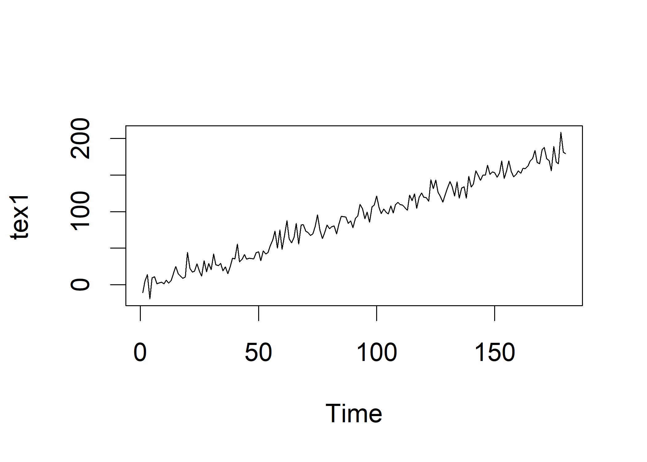 Let’s create a second variable and then correlate them:
ex2 <- rnorm(n=tslen,mean=0,sd=10)     # Make another random variable
tex2 <- ex2 + seq(from=1, to=tslen, by=1)   # Add the fake upward trend
cor(ex1, ex2)   # Correlation between the two random variables
## [1] -0.09385519
cor(tex1, tex2)   # Correlation between the two time series
## [1] 0.9634188
The ex1 and ex2 are tiny correlated because they are created as random normal distributions. The tex1 and tex2 are highly correlated because of the upward trend that we inserted in both time series. There are several aspects of time series including trend (growth or decline across time), seasonality: regular fluctuations that occur over and over again across a period of time, cyclicality (there may be repeating fluctuations that do not have a regular time period to them) and irregularity (random fluctuations that are not related to any other aspect of the time series).
Now we create another variable to see the effect of seasonality:
ex3 <- rnorm(n=tslen,mean=0,sd=10)
tex3 <- ex3 + seq(from=1, to=tslen, by=1) # Add the fake upward trend
tex3 <- tex3 + sin(seq(from=0,to=36,length.out=tslen))*20
plot.ts(tex3)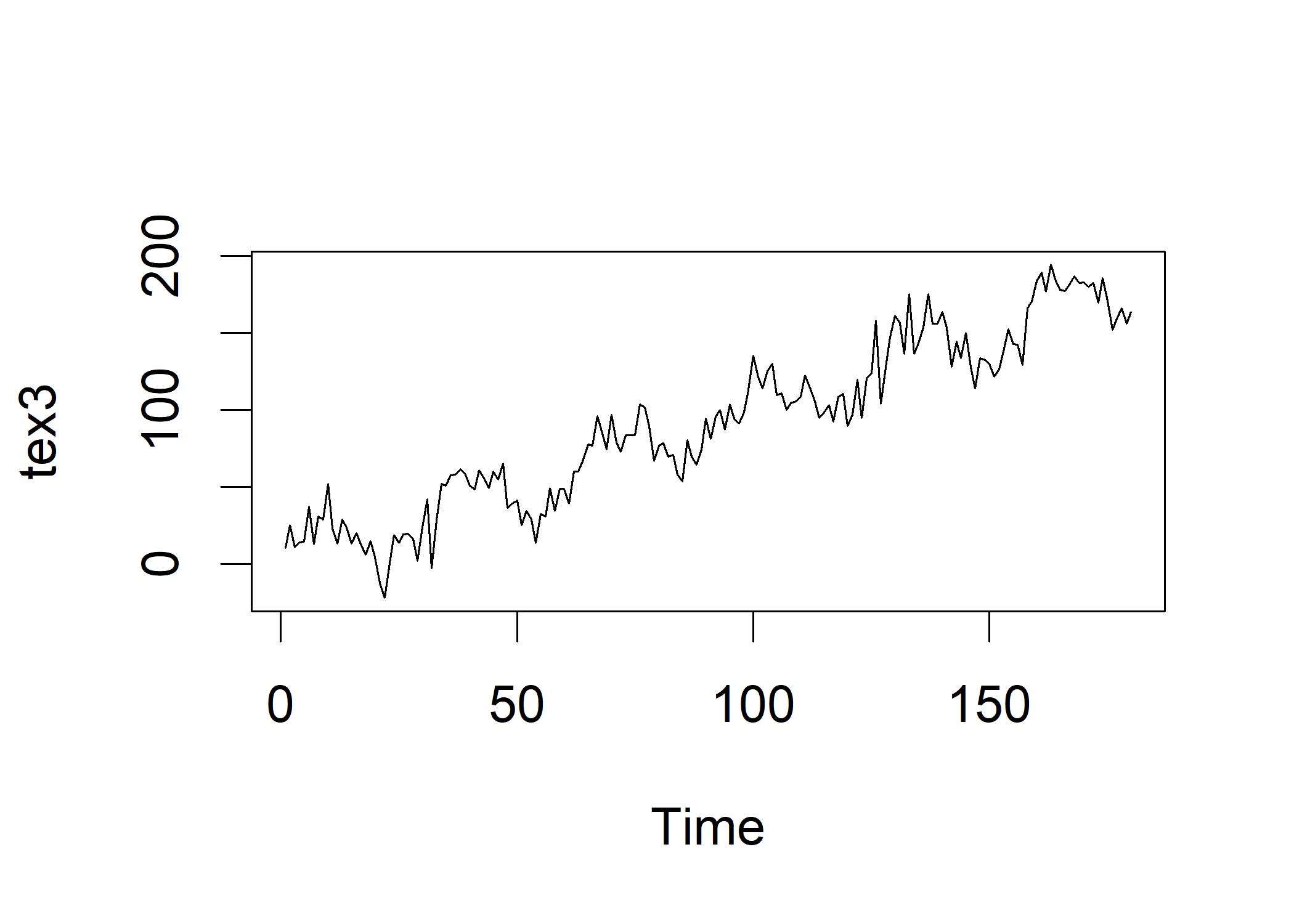 We decompose the time series into its components:
# 30 days per month
decOut <- decompose(ts(tex3,frequency=30))
plot(decOut)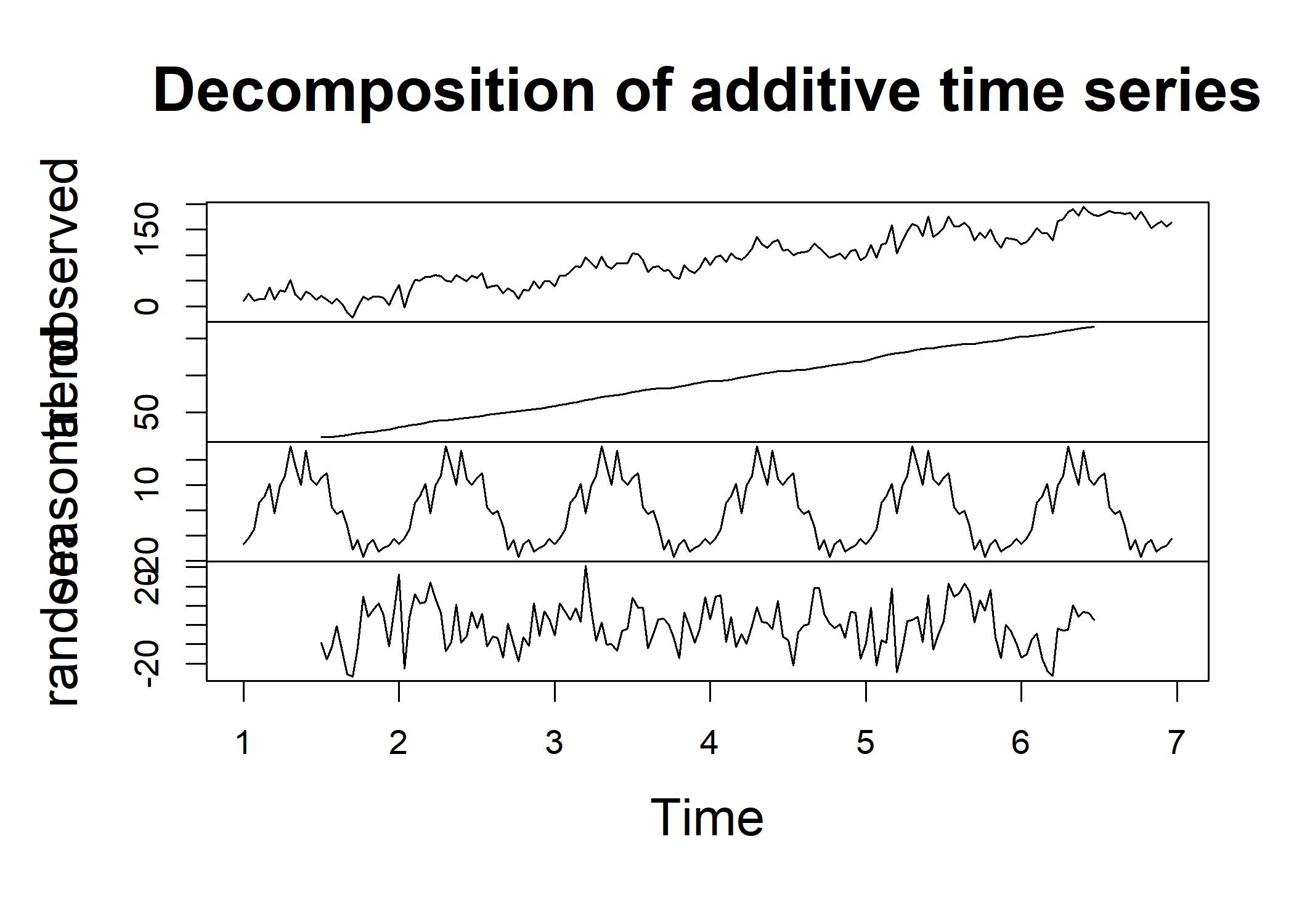 The trend is in the top panel and shows the linear climb. The seasonal component is in the middle panel and shows the sinusoidal pattern. The irregular component is in the bottom panel and shows the random fluctuations.
This is all the variation that is left over after the trend and the seasonality are substracted our of the time series.
Now we run correlation tests on the time series:
The trend is in the top panel and shows the linear climb. The seasonal component is in the middle panel and shows the sinusoidal pattern. The irregular component is in the bottom panel and shows the random fluctuations.
This is all the variation that is left over after the trend and the seasonality are substracted our of the time series.
Now we run correlation tests on the time series:
# “na.rm=TRUE” to ignore the missing values.
# both the head and tail of $trend and $random contain missing values.
mean(decOut$trend, na.rm=TRUE)
## [1] 90.22522
mean(decOut$seasonal)
## [1] 1.262782e-16
mean(decOut$random,na.rm=TRUE)
## [1] -0.5675377
cor(ex3, decOut$random, use="complete.obs")
## [1] 0.8304297
The first line reflects how we create the trend using a sequence of numbers from 1 to 180. The second line reflects a small mean that reflects a sine wave that oscillates around 0. The last line shows a \(r\) of .083, meaning that decompose() is able to extract the irregular component of the time series with a reasonable degree of success. The correlation is used to determine how successful decompose() was in removing the trend and seasonality components from the original time series. One of such correlation function is called autocorrelation. It is a correlation between a time series and a lagged version of itself. Autocorrelation is used to determine whether there is a pattern in the time series that repeats itself over time. For example, the temperatures on different days in a month are autocorrelated.
| oberservation # | MyVar | lag(MyVar, k=1) | lag(MyVar, k=2) |
|---|---|---|---|
| 1 | 2 | ||
| 2 | 1 | 2 | |
| 3 | 4 | 1 | 2 |
| 4 | 1 | 4 | 1 |
| 5 | 5 | 1 | 4 |
| 6 | 9 | 5 | 1 |
This table shows the data shifted down by one or two time periods. First we look at the first time series
acf(ex1) This autocorrelation plot shows a stationary (contains no trend component and no cyclical component) process. The height
of each line shows the sign and magnitude of the correlation of the original variable correlated with a lagged version of itself.
The horizontal dotted lines show the threshold of the statistical significance of the correlation.
For a stationary process, all the lagged correlation should be non-significant and the height of the lines should be close to 0.
Now we can see what happens when we add the trend:
This autocorrelation plot shows a stationary (contains no trend component and no cyclical component) process. The height
of each line shows the sign and magnitude of the correlation of the original variable correlated with a lagged version of itself.
The horizontal dotted lines show the threshold of the statistical significance of the correlation.
For a stationary process, all the lagged correlation should be non-significant and the height of the lines should be close to 0.
Now we can see what happens when we add the trend:
tex1 <- ex1 + seq(from=1, to=tslen, by=1)
acf(tex1)
After adding the trend, the autocorrelation plot shows a positive autocorrelation over many lags. The less obvious trend results in smaller ACFs.
Now let’s look at the tex3 with both trend and seasonality:
After adding the trend, the autocorrelation plot shows a positive autocorrelation over many lags. The less obvious trend results in smaller ACFs.
Now let’s look at the tex3 with both trend and seasonality:
acf(tex3)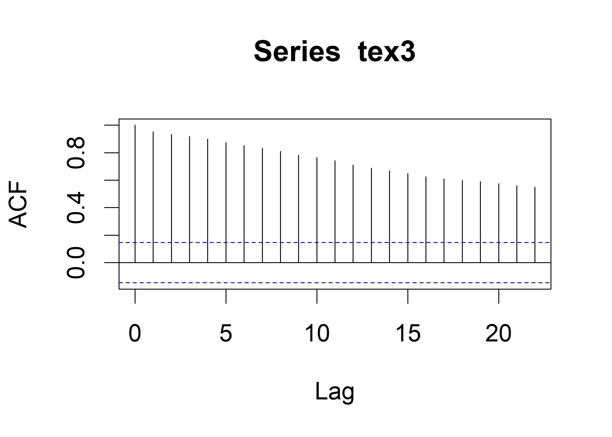 This looks similar to the tex1.
# na.action=na.pass to ignore the missing values.
acf(decOut$trend,na.action=na.pass)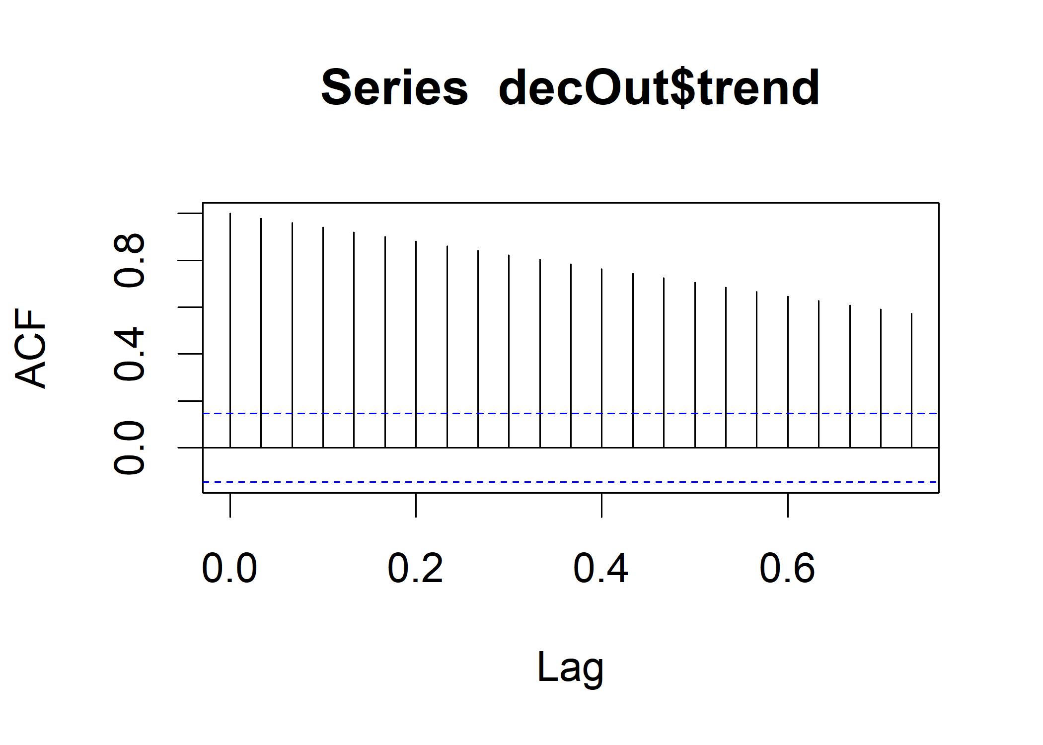 This plot is calibrated according to the frequency =30.
acf(decOut$seasonal)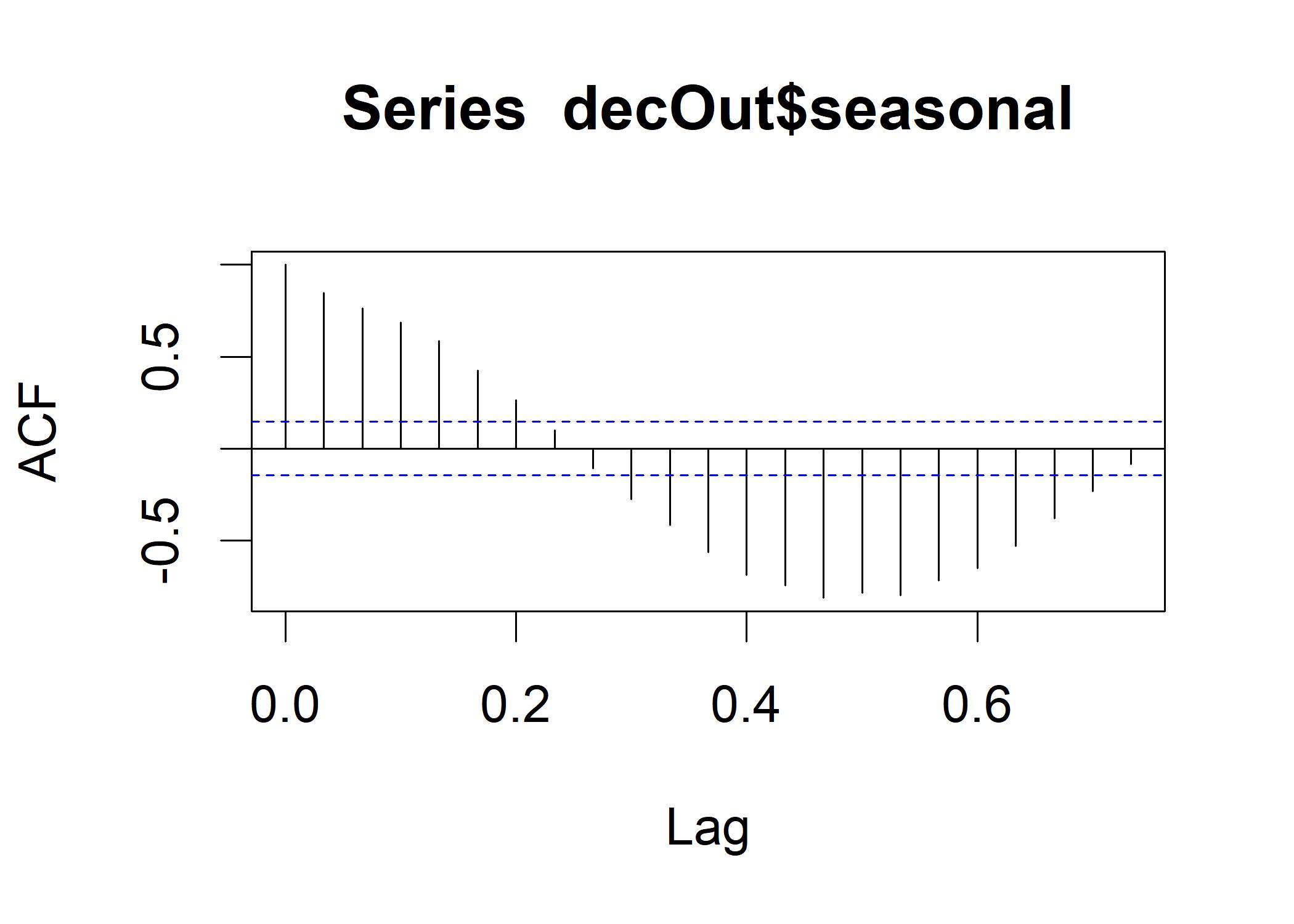 The strongest negative correlation occurs right near .5, indicating that half of a cycle occurs in half of a month.
Now let’s look at the irregular component:
The strongest negative correlation occurs right near .5, indicating that half of a cycle occurs in half of a month.
Now let’s look at the irregular component:
acf(decOut$random, na.action=na.pass)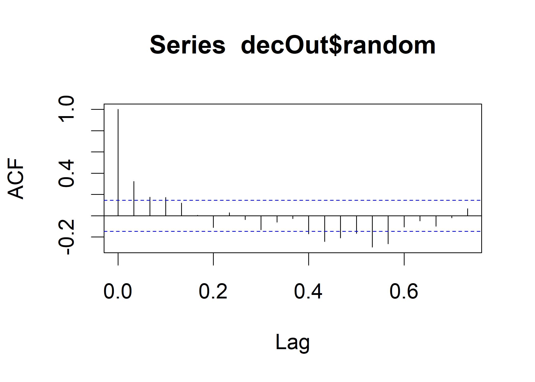 If the decomposition is successful that all the trend and seasonal components are removed from random, we should see a plot that looks like the tex1.
A stationary process is one that does not have a trend or a cyclical component, which have no statistical autocorrelation.
This removal process is called whitening. In this plot, the sinusoidal pattern is still present at a low level, which means the whitening is imperfect.
Now we run a test about whether this is a stationary process by using the augmented Dickey-Fuller test:
If the decomposition is successful that all the trend and seasonal components are removed from random, we should see a plot that looks like the tex1.
A stationary process is one that does not have a trend or a cyclical component, which have no statistical autocorrelation.
This removal process is called whitening. In this plot, the sinusoidal pattern is still present at a low level, which means the whitening is imperfect.
Now we run a test about whether this is a stationary process by using the augmented Dickey-Fuller test:
# install.packages("tseries")
library(tseries)
decComplete <- decOut$random[complete.cases(decOut$random)]
adf.test(decComplete) # Shows significant, so it is stationary
##
##  Augmented Dickey-Fuller Test
##
## data:  decComplete
## Dickey-Fuller = -5.1302, Lag order = 5, p-value = 0.01
## alternative hypothesis: stationary
The alternative hypothesis is that the time series is stationary. We have done a reasonably good job of removing the trend and seasonality components from the time series.